The most popular and comprehensive Open Source ECM platform
Let us know more


USA Today was a pioneer in the trend towards creating a more graphic presentation of news data. The newspaper sensed early on that people are often more quick at understanding complex news and facts when data is presented graphically. USA Today’s style is slowly being adopted by other papers, like the New York Times and, to some extent, even the Wall Street Journal.
Data visualization used as a tool for communicating information is being called Infographics. And it is becoming ever more popular.
Kim Baer, author of the Information Design Workbook wrote that “with all this information flying at us, we’re craving some guidance to help us sort through it. Hence the preponderance of blogs, news aggregators, content-specific RSS feeds, and an even greater need for information graphics and charts to help visually distill information.”
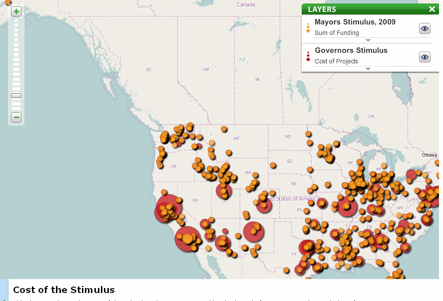
A well-done infographic can be powerful and change opinions almost instantly. That’s what a frustrated Barack Obama is hoping. He recently enlisted infographics guru Edward Tufte to help “track and explain $787 billion used in recovery stimulus funds.”
Tools are making it ever easier for people to interactively visualize their data. There are now a number of web sites that encourage their users to actively participate. These sites provide a method for people to upload their data and also the tools to graphically interact with that data.
Some of the sites include:
Public Data Explorer — Google’s interactive visualization of some of the most searched-for data sets.
Many Eyes — IBM’s data visualization site lets you upload, graph and share data sets.
Swivel — Data visualization site that lets you upload, graph and share data.
Tableau Public — Client software to visualize data and then publish to the web.
Geocommons — FortiusOne’s visualization of geodata. Create shareable maps.